Anchor Tickets
Ticket Booking Website
Project Overview
The product:
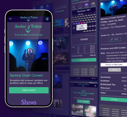
The ticket booking website makes it easy for adults and teens to view events, choose seats, purchase tickets, and invite friends to attend.
Project duration:
This project was completed during a two-month period in 2022.
The problem:
Many online ticketing sites do not offer ways for users to quickly select their seating. The layouts are often cluttered and confusing. Sharing specific concert information with friends can be cumbersome.
The goal:
The Ticket Booking Website will let users find events, choose seating, and share concert information. This will help users looking to attend concerts and charity events by allowing them to quickly and easily purchase their tickets and invite their friends.
My role:
UX/UI Researcher and Designer
Responsibilities:
Conducting interviews, paper and digital wireframing, low and high-fidelity prototyping, conducting usability studies, accounting for accessibility, iterating on designs, and responsive design.
Understanding the user
- User research
- Personas
- Problem statements
- User journey maps
User research was conducted through in-person observation and interviews. The assumption was that most users would have previous experience purchasing tickets to events online. Research revealed that many users had not purchased live event tickets online. Most users have purchased movie and airplane tickets online. However, these same users hesitated to purchase live event tickets because they were not sure their friends would attend the event with them. They were also concerned about choosing the seating. Users described hesitation in the decision-making resulting in tickets selling out before they could decide to purchase anything. Based on these insights,
I worked to streamline the seat selection process and to include an invite and social share feature to help users make the purchase with confidence and share the event information with friends
I worked to streamline the seat selection process and to include an invite and social share feature to help users make the purchase with confidence and share the event information with friends
Navigation
Ticketing websites can be cluttered and confusing. This makes it difficult for users to choose the event they would like to attend.
Unsure about seating
Seat selection maps can lack the information a user needs about accessibility and pricing, leading to a difficult purchasing decision.
Users want to share
Event websites lack the ability to easily share information with and invite friends to an event.
Persona
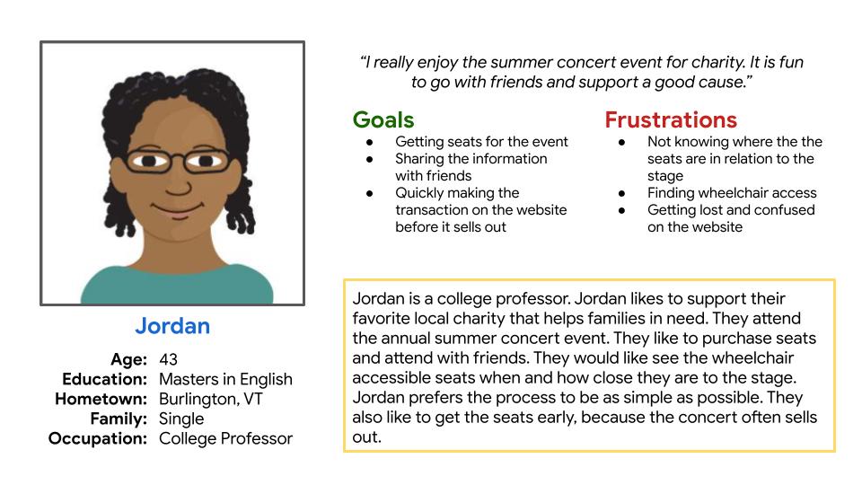
Problem statement:
Jordan is a college professor who needs to purchase event tickets for a group of friends because they want to support the local charity by attending the concert.
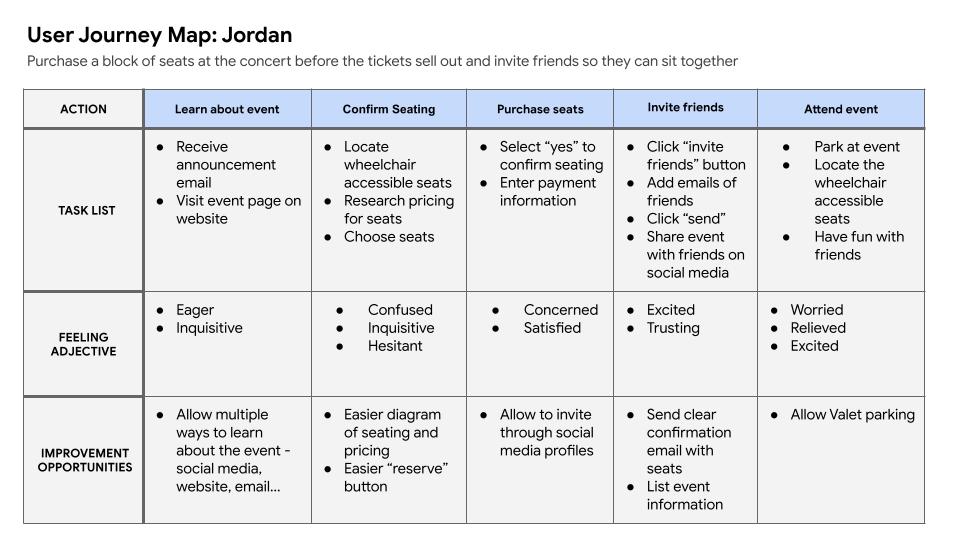
User journey map:
I created the user journey map of Jordan’s experience using the site to help identify pain points and opportunities for improvement in the design.
Starting the design
- Sitemap
- Paper wireframes
- Digital wireframes
- Low-fidelity prototype
- Usability studies
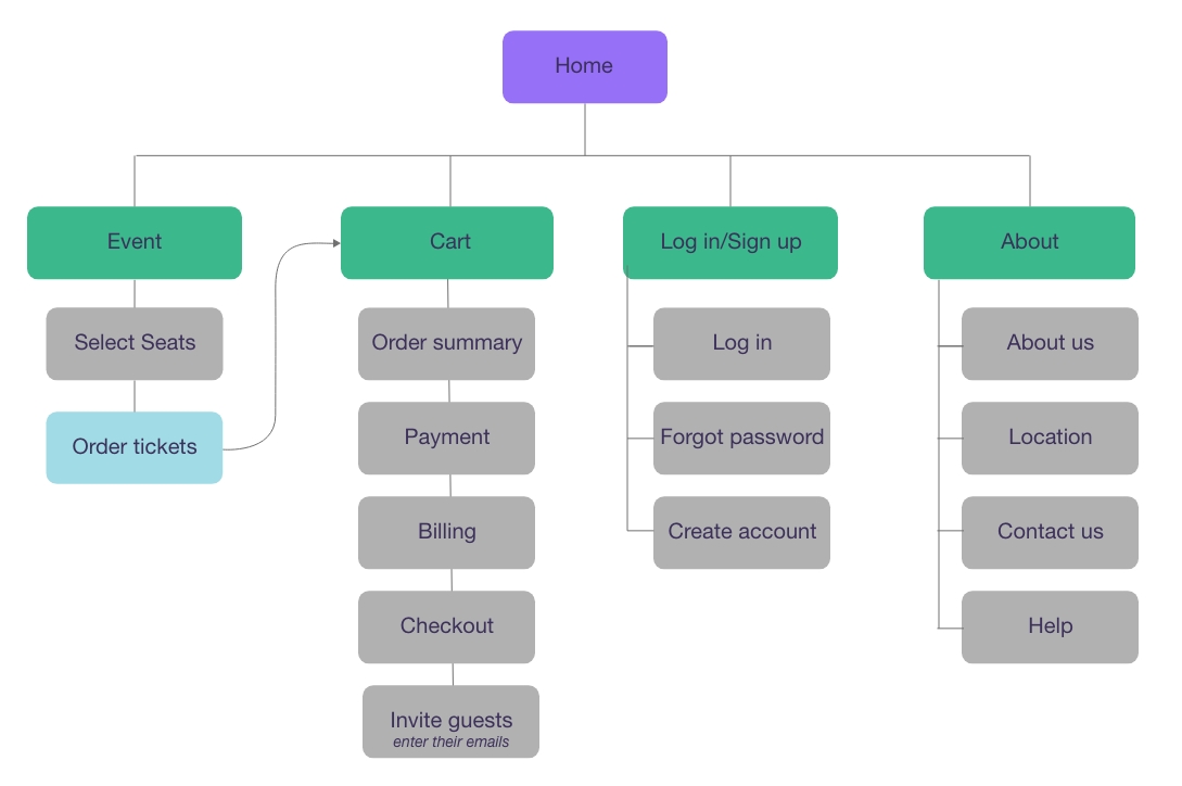
Sitemap
The site map shows a hierarchical website structure designed to be easy for users to navigate.
Paper wireframes for desktop size
The desktop paper wireframes were designed with an open layout and clear call-to-action buttons designed to address the user pain points about navigation.
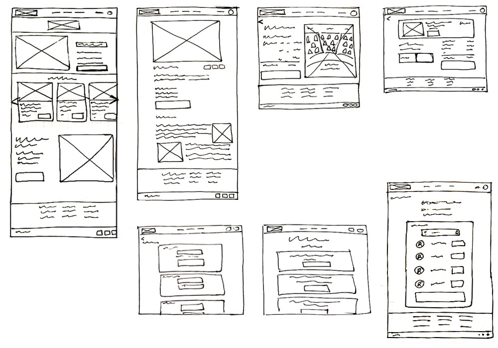
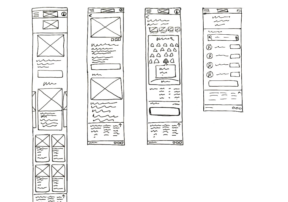
Paper wireframes mobile size
The mobile wireframes are designed to be easy to scroll on a phone, with a clear navigation system. Users will most likely be purchasing event tickets from their phones and will benefit from a responsive design.
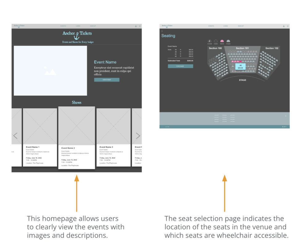
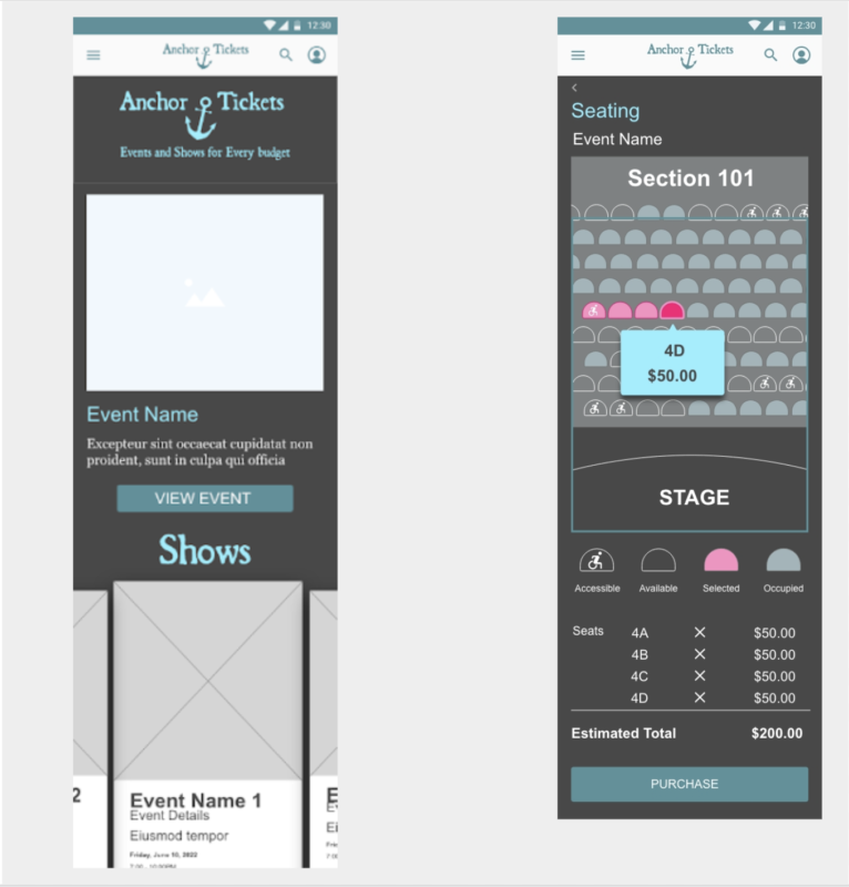
Digital wireframes
The wireframes were designed for users to quickly find the event and seating information.
Digital wireframe for mobile
The mobile wireframes keep the design open and easy to navigate. They allow the users to scroll through events and select seats using the touch screen.
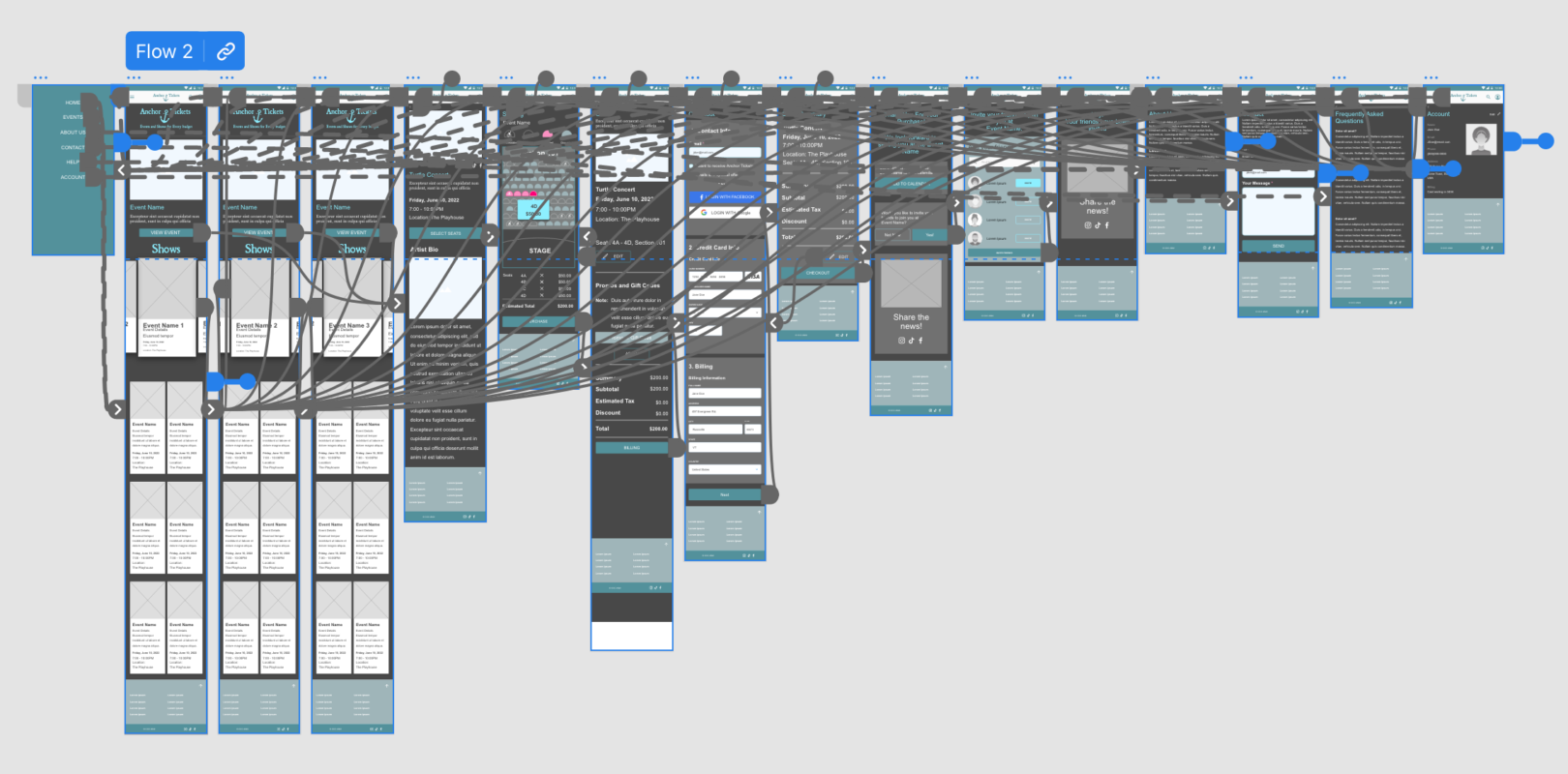
Low-fidelity prototype
The prototype has an open layout and clear call-to-action buttons. This simple design limits the number of decisions a user needs to make at one time to reduce user indecision.
View the Desktop Prototype
View the Mobile Prototype
Usability Study
Study type:
- Moderated usability study
- Location:
United States, in-person - Participants:
5 participants - Length:
20-30 minutes
Findings
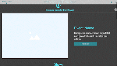
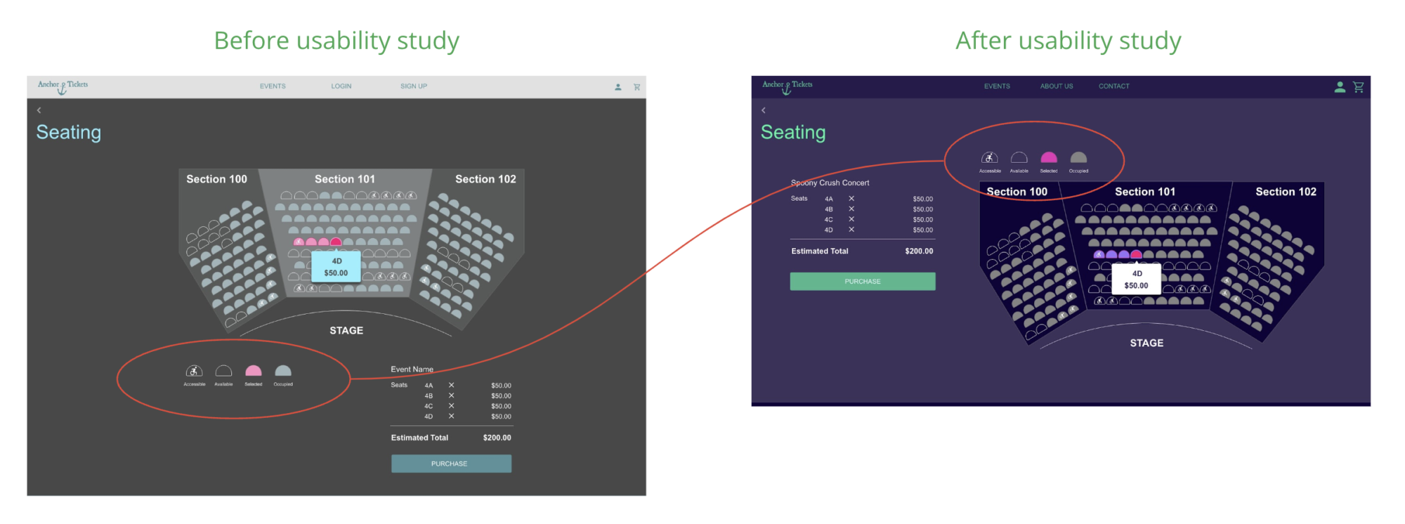
- Users want to see where the seats are in relation to the stage and which ones are wheelchair accessible.
- Users want clear per-seat pricing information.
- Users want to invite their friends to the event and share the information on social media so they are not attending alone.
Refining the design
- Mockups
- High-fidelity prototype
- Accessibility
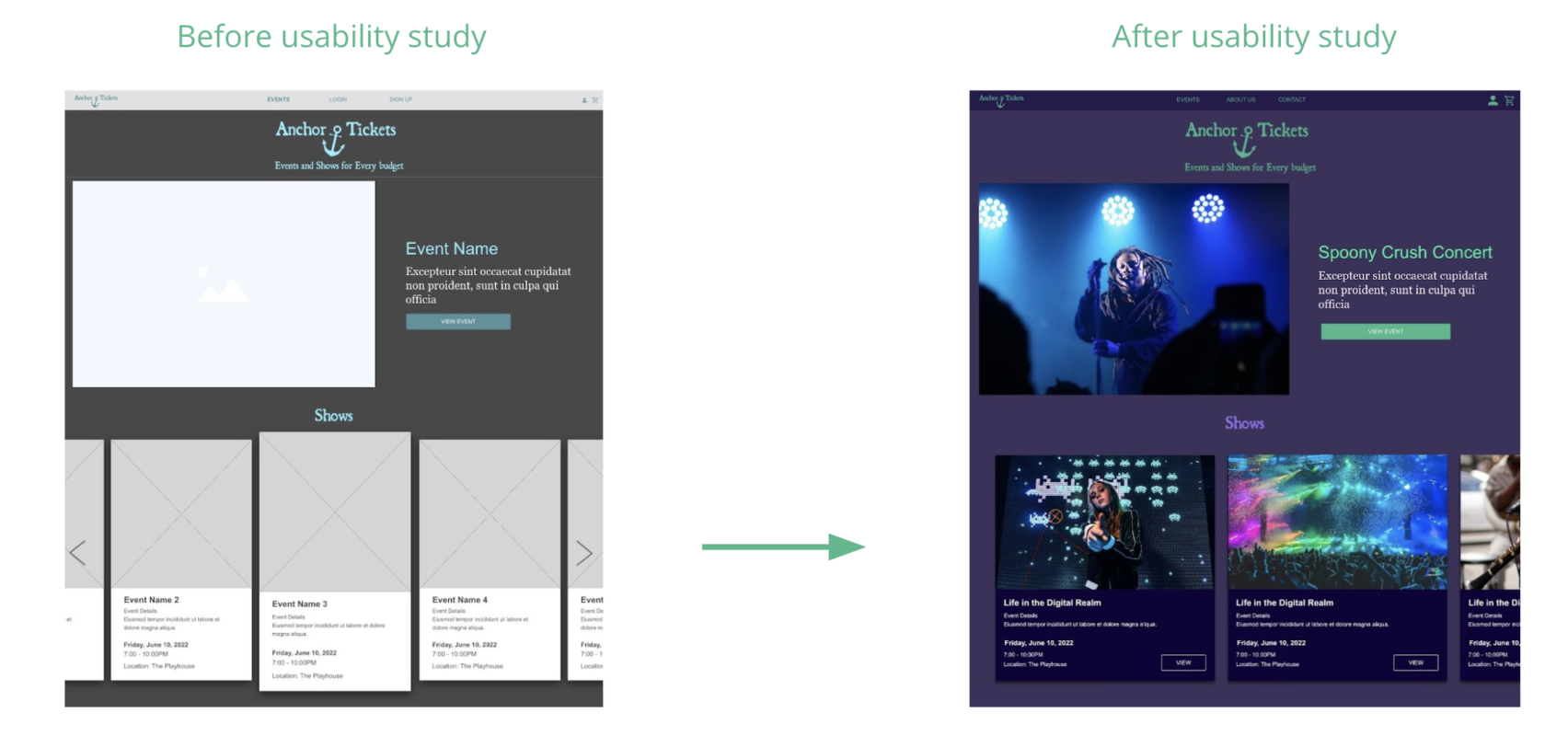
Mockups
- Users enjoyed scrolling through event slides and preferred a less cluttered design.
- Users were confused about the seating choices. Moving the seating key above the selection area and keeping important information above the fold helped users quickly choose their seats.
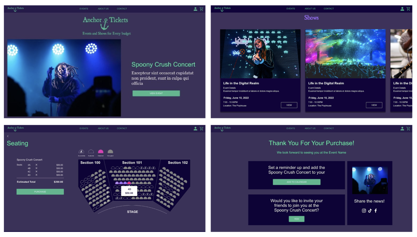
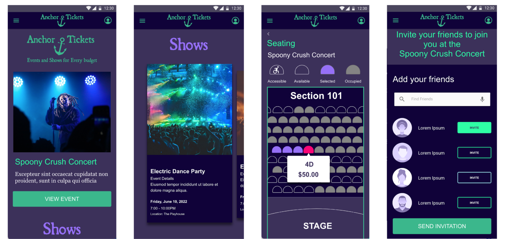
The high-fidelity prototype incorporates user feedback from earlier designs to create a simple-to-use ticket purchasing experience.
View the Mobile Prototype
View the Desktop Prototype
Accessibility
The site is designed with hierarchical headings to improve accessibility and allow users to tab through the web page.
Colors have been carefully chosen to meet accessibility contrast and color requirements.
Wheelchair-accessible seating is clearly indicated on the seat selection map.
Going forward
- Takeaways
- Next steps
Impact:
User feedback on the project was very positive. Users liked the simplicity of the design and the ease of choosing seating. This user quote sums it up:
“I can get tickets to the concert and invite my friends, all from one website. It was as easy as getting movie tickets.”
What I learned:
During the course of this project, I was able to clearly define the users’ problem goals and frustrations. The empathy I developed toward the user and feedback from user research helped me refine my designs. I was able to simplify and improve the design during each step of the process.
Next steps
I would like to continue to explore this project and the different ways a user can invite friends to the concert and share payment options.
I would enjoy adding different types of event seating maps, such as charity dinners and auctions.
I would like to map out what the experience would be for the venue owner adding a new event to the website.
Contact
Thank you for reviewing my Ticketing Website project.
Please contact me to learn more about my work.