Helping Hands
Food Bank
UX/UI Case Study
The product:
Helping Hands is a food bank tool to help people experiencing food insecurity. The primary target users include families and older adults who can’t afford the food they need. Some people find accessing the food bank difficult due to transportation or scheduling challenges.
Project duration:
July 2022 – August 2022
The problem:
Food insecurity affects many members of the community. Helping Hands food bank has identified difficulties in scheduling and transportation as barriers to families looking for assistance. The food bank also would like to provide funds to cover essential items not included in the weekly food boxes.
The goal:
Design an app that will improve the accessibility to food resources for community members requiring emergency food assistance.
Project overview
My role:
UX designer leading the app and responsive website from conception to delivery.
Responsibilities:
Conducting interviews, paper and digital wireframing, low and high-fidelity prototyping, conducting usability studies, accounting for accessibility, iterating on designs, information architecture, and responsive design.
Understanding the user
- User research
- Personas
- Problem statements
- User journey maps
- Competitive Audit
- Ideation
User research: Summary
I used available news articles and food bank data to research the difficulties for people facing food insecurity. I interviewed people working at food banks and people who had accessed food assistance. The feedback received through the research revealed that people facing food insecurity are often working parents, the elderly, and disabled adults. They reported difficulty getting to the food bank because of scheduling or mobility issues. They also were looking for assistance purchasing items that are not available in the food banks, such as medicine or personal hygiene items.
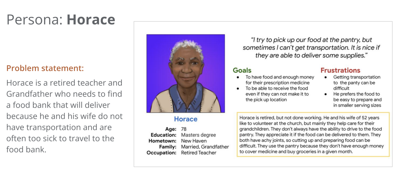
Persona: Horace
Problem statement:
Horace is a retired teacher and Grandfather who needs to find a food bank that will deliver because he and his wife do not have transportation and are often too sick to travel to the food bank.
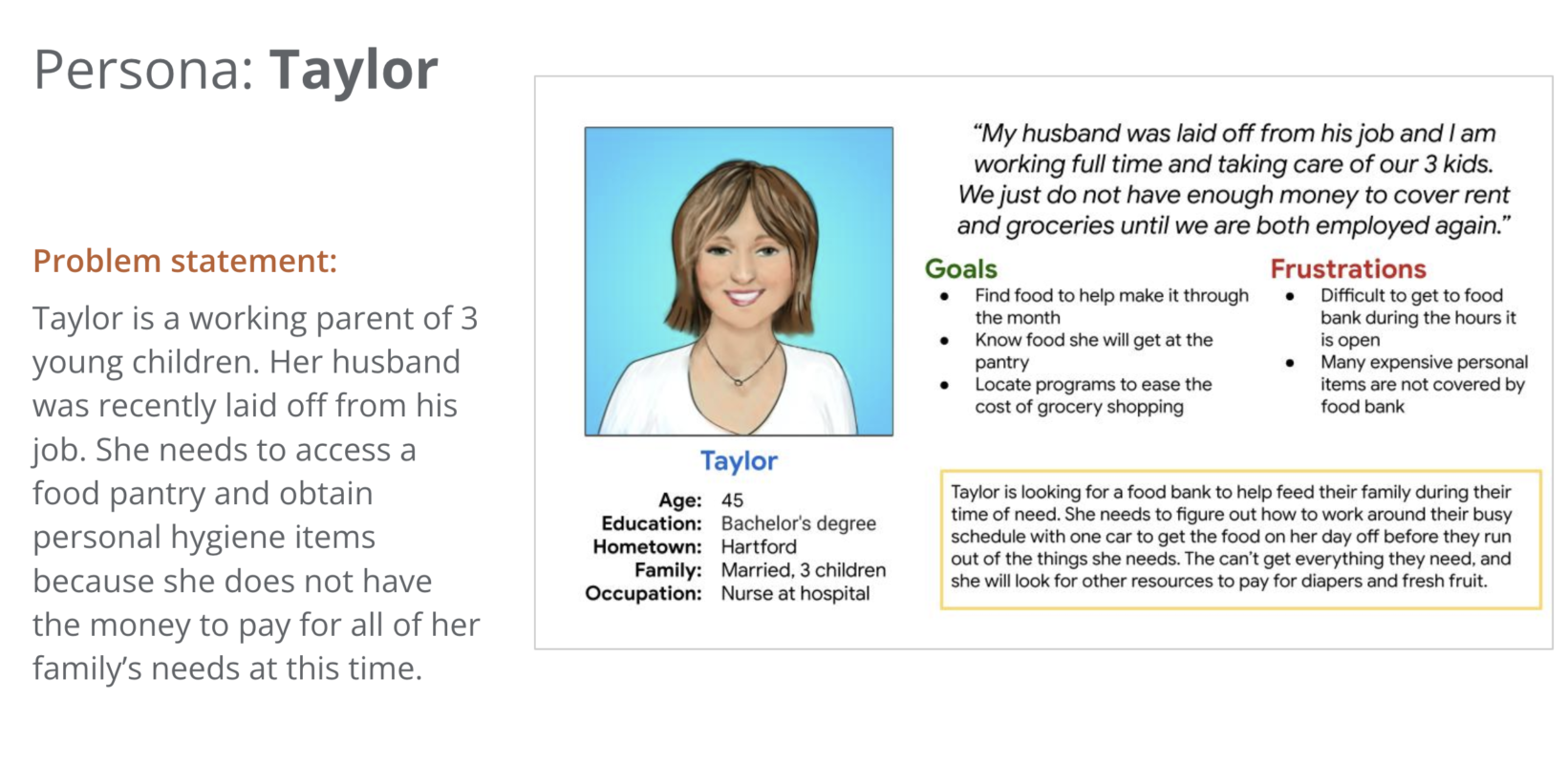
Persona
Problem statement:
Taylor is a working parent of 3 young children. Her husband was recently laid off from his job. She needs to access a food pantry and obtain personal hygiene items because she does not have the money to pay for all of her family’s needs at this time.
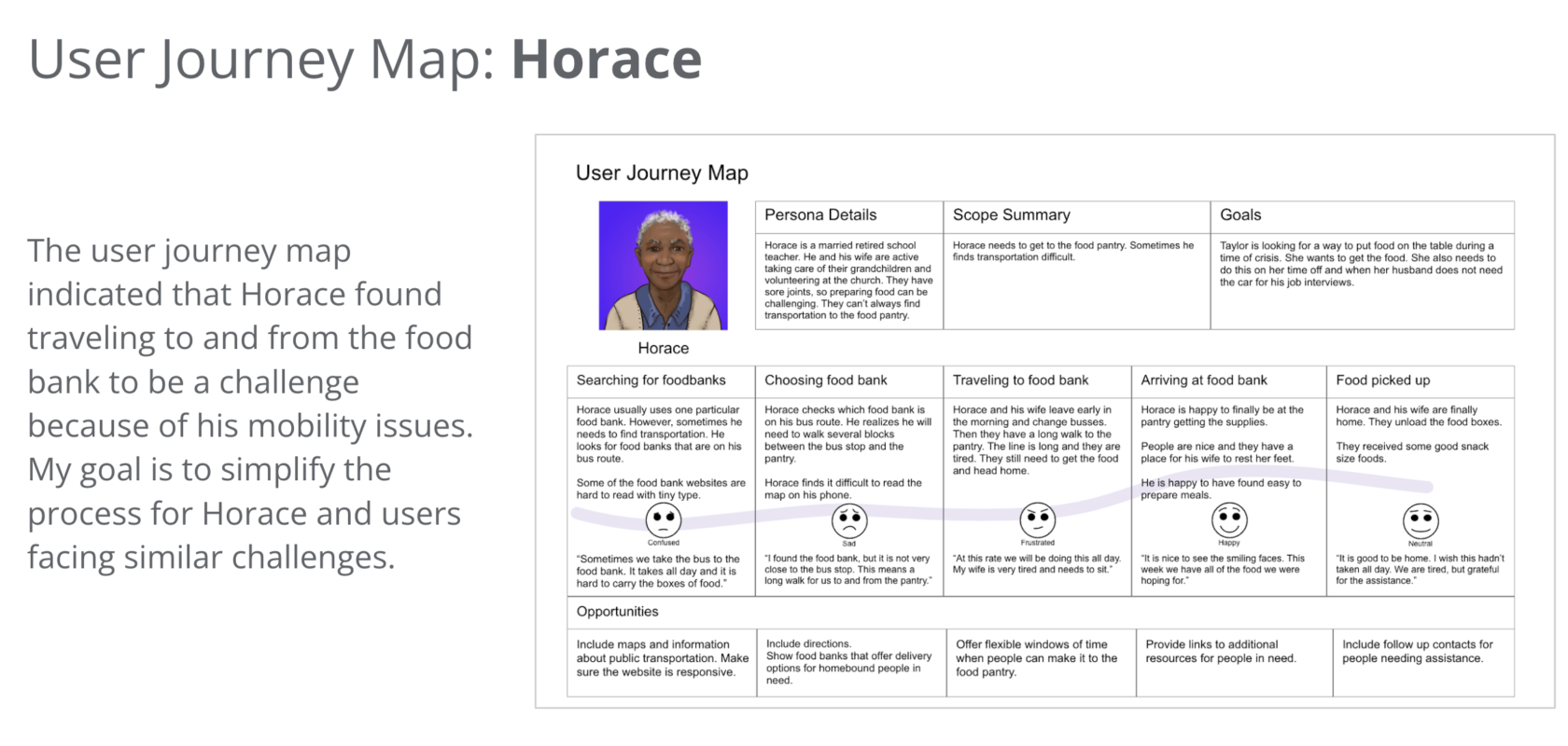
User journey map
The user journey map indicated that Horace found traveling to and from the food bank to be a challenge because of his mobility issues. My goal is to simplify the process for Horace and users facing similar challenges.
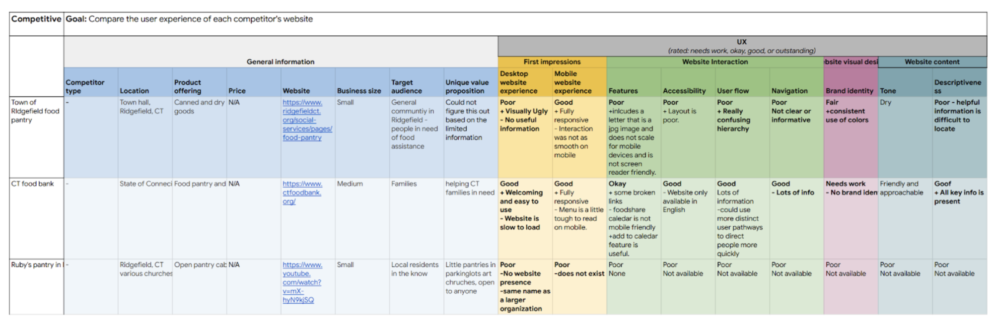
Competitive audit
An audit of other food resources in the community provided directions on gaps and opportunities to address with the Helping Hands food bank app.
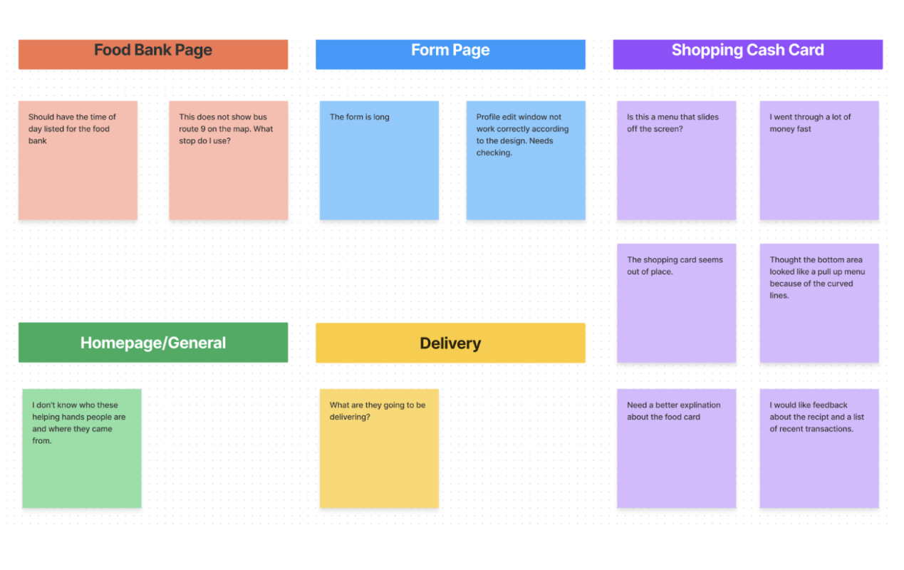
Affinity diagram
Creating an affinity diagram based on feedback from the usability study allowed me to discover common themes and relationships. I developed insights based on the user data and prioritized design changes.
Ideation
I did a quick ideation exercise to generate ideas for how to address the gaps identified in the competitive audit.
Starting the design
- Paper wireframes
- Digital wireframes
- Low-fidelity prototype
- Usability studies
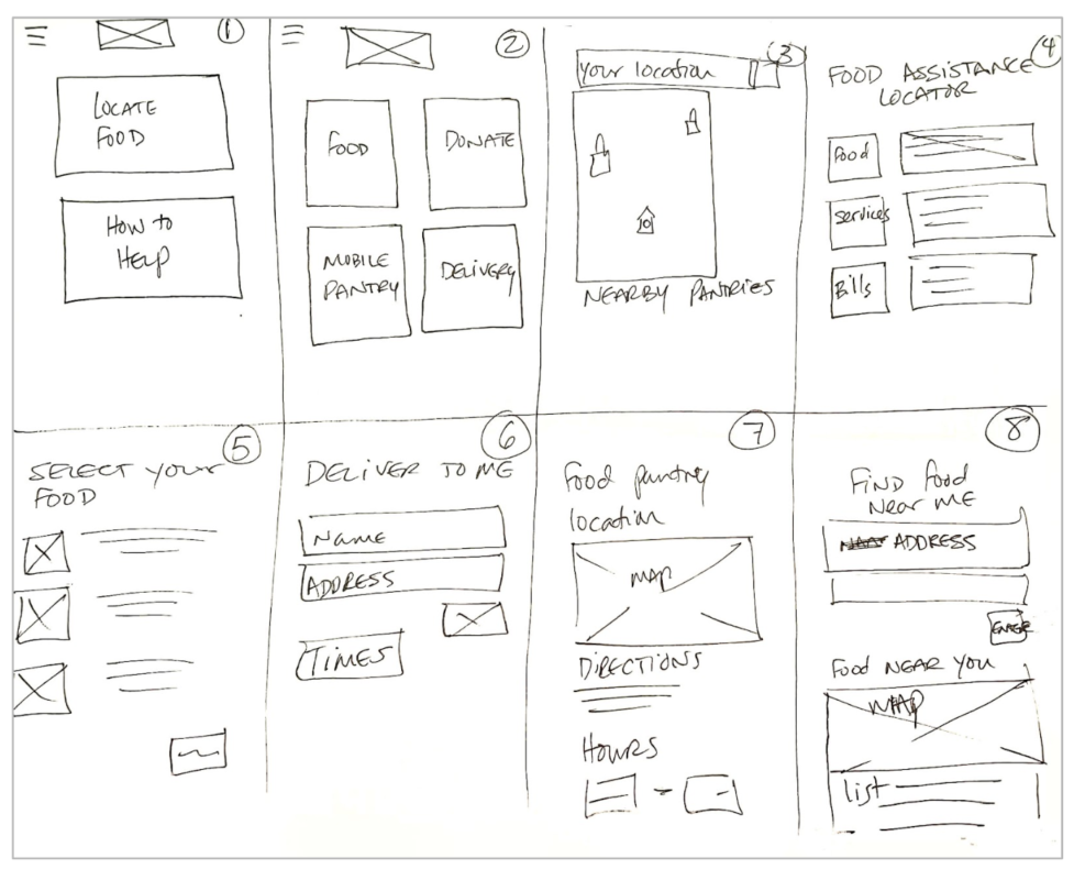
Paper wireframes
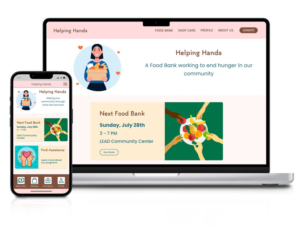
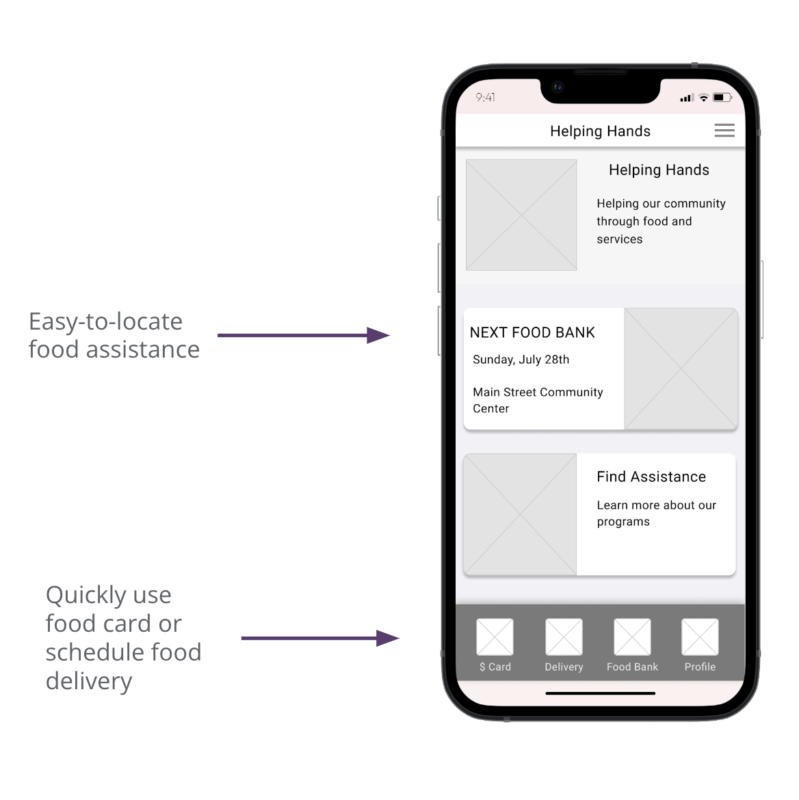
I experimented with different layouts in the paper diagrams of the homepage. I combined the best ideas and began drafting the digital wireframe of that design. This design includes an easy-to-locate button to schedule food delivery.
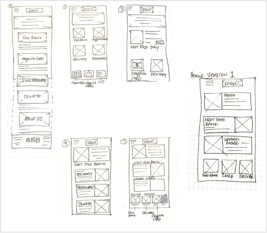
Digital Wireframes
Users would be accessing the Food Bank app through their mobile device. The design allows users to quickly locate a food bank, schedule deliveries, or use the prepaid shop card to buy personal hygiene items.
Low-fidelity prototype
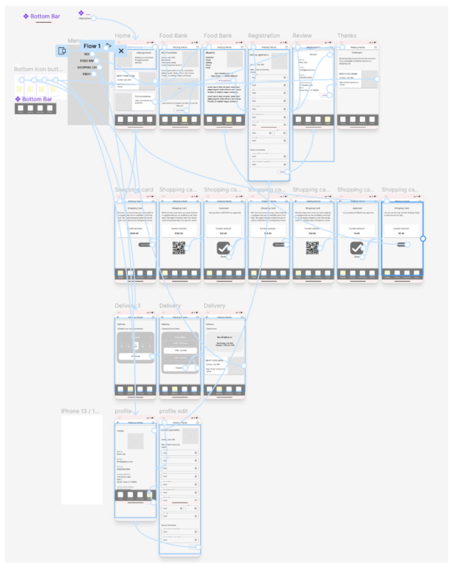
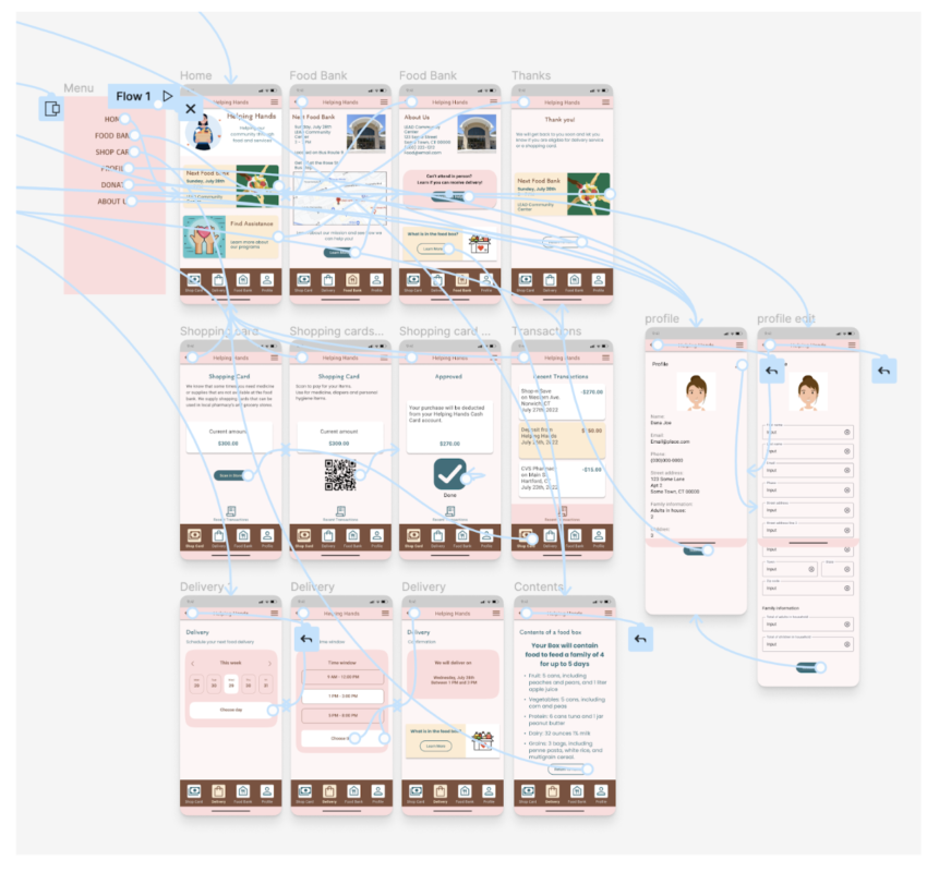
To prepare for usability testing, I created a low-fidelity prototype that connected the user flow for scheduling a food box delivery.
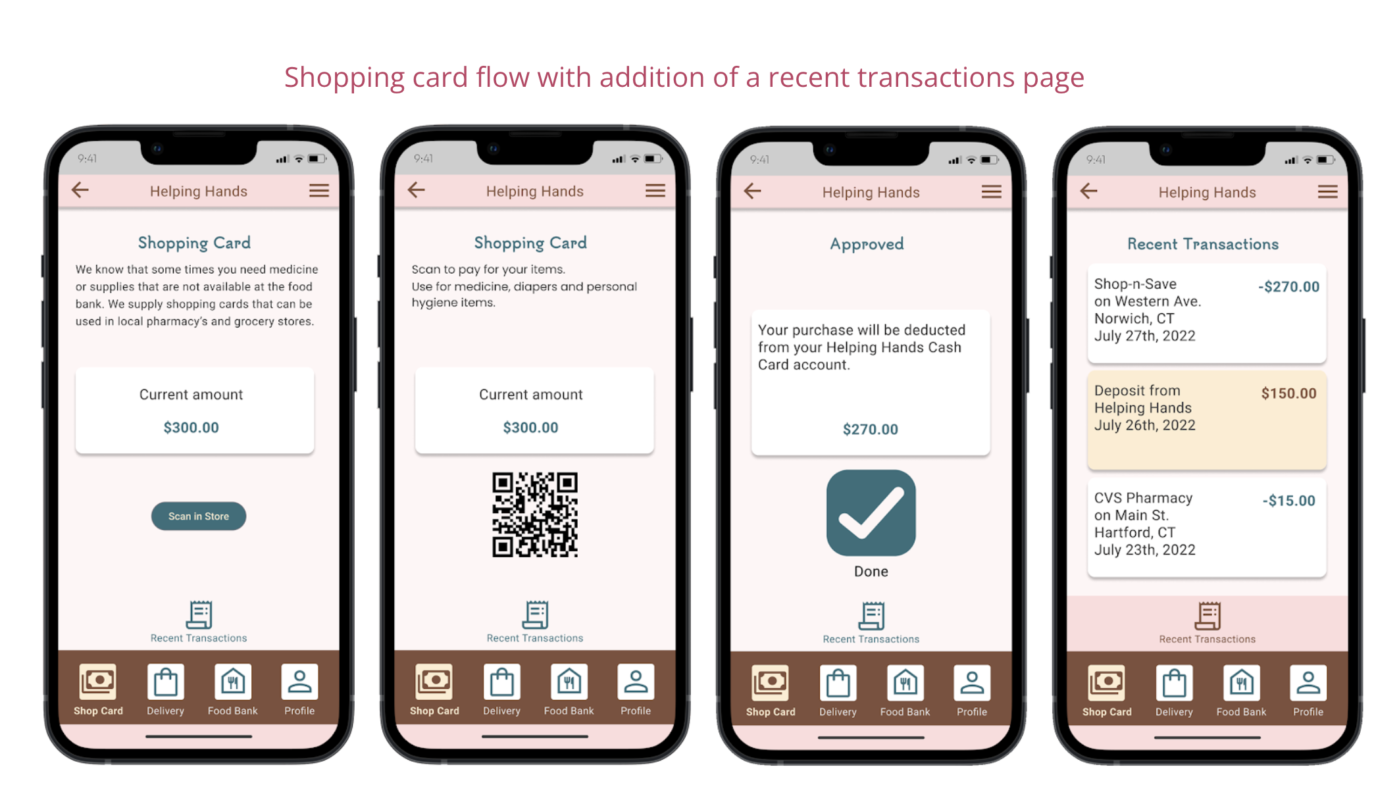
I also connected the user flow for using the shop card for in-store purchases of items not offered through the food bank.
Usability study: parameters
Study type:
Moderated usability study
Location:
Connecticut, in-person
Participants:
5 participants
Length:
30 minutes
Usability study: findings
People with mobility issues would like to have the food boxes delivered to them. They would like the option of choosing a delivery window.
Not all items are available at the food bank. Personal Hygiene items need to be purchased at a store. Users requested a food card provided by the food bank.
Users wanted to know the bus routes and other public transportation available to access the in-person food bank.
Digital wireframes
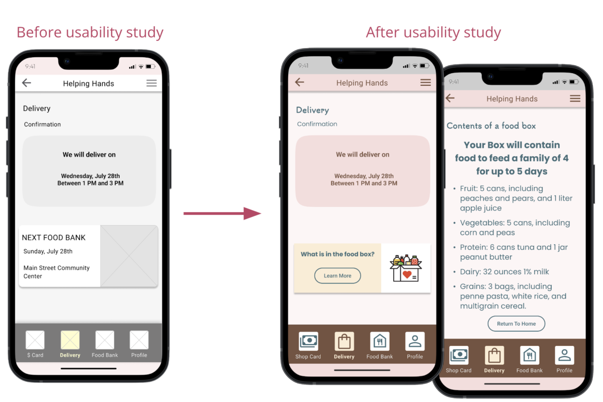
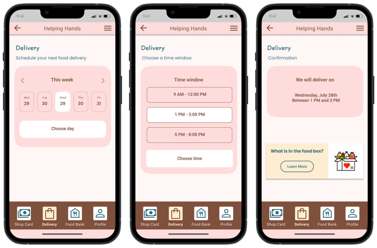
Food Bank members can use the delivery schedule to plan their next meal delivery. This feature is available for people who are homebound, such as seniors, or people with limited mobility.
Flexible time windows are available for home delivery.
Easy to locate delivery button.
Refining the design
- Mockups
- High-fidelity prototype
- Accessibility
Based on feedback from the usability study I added details about the time of the next food bank event. Users had difficulty finding the bottom interactive area. Based on the feedback I used higher contrast to make it easier for users to find.
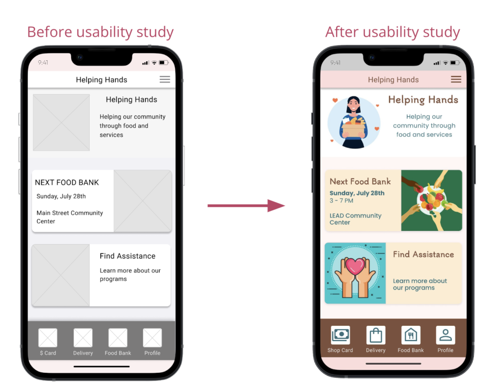
Based on insights from the usability study, I adjusted the design to provide users with more information about the contents of their food box.
Improvements in the design
Based on feedback from the usability study I added details about the time of the next food bank event. Users had difficulty finding the bottom interactive area. Based on the feedback I used higher contrast to make it easier for users to find.
Based on insights from the usability study, I adjusted the design to provide users with more information about the contents of their food box.
The high-fidelity prototype includes improvements in layout and additional information to ease pain points discovered through the previous usability study.
You can view the
high fidelity prototype here
high fidelity prototype here
Accessibility considerations
- Clear labels for interactive elements that can be read by screen readers.
- Mapping and bus route information for users.
- Ease of use from mobile phones because many users do not have access to a home desktop computer.
Responsive Design
- Information Architecture
- Responsive design
Information Architecture
The site uses a hierarchical site map. Users are provided a simple step-by-step process to complete actions such as scheduling. The site map allowed me to plan a consistent experience across devices.
Responsive Designs
Using progressive enhancement, I designed the app to serve food bank users who would be accessing the app through their smartphones. Larger screens have additional information that will be accessed by organizations looking to assist the food bank with donations.

Going Forward
Takeaways
Impact:
The local food banks reported that this app will be extremely helpful in reducing food insecurity in the community.
What I learned:
Fighting food insecurity starts with sharing information. The barriers to people trying to feed their families can be reduced through research, careful planning, and the design of an app that considers their needs and pain points.
Next Steps
- Conduct research on how successful the app is in reaching vulnerable populations and reducing food insecurity.
- Expand the donation pages to include information for individuals, institutions, and groups offering matching grants.
- Connect to government-provided benefits such as snap and food stamps.
Contact
Thank you!
I am a UX/UI and visual designer.
Linkedin profile: https://www.linkedin.com/in/priscillaprentice/