NFT Sales Tax Dashboard
UX/UI Design | Multi-Persona SaaS | Developer Hand-Off
Led UX/UI for an accessible NFT sales tax platform, taking user flows off the dev team’s hands so they could focus on building the product.


Tax compliance for digital assets is complex and high-stakes. The goal was to design an intuitive dashboard that simplifies NFT sales tax collection across three distinct user groups (ranging from everyday shop managers to state revenue auditors), all while ensuring a seamless developer handoff.
Instead of a one-size-fits-all layout, I mapped out specific journeys for three core groups:

Shop managers: They just want to run their store. I kept the user journey steps simple, showing them what they need to do to do their part without overwhelming them with data.

Finance Teams: They need the full picture. I gave them deep visibility into internal financial mechanics and compliance metrics with a clear timeline.

State Revenue Auditors: They need proof. I made sure data trails and tracking were clear and audit-ready.
Part of my job was explaining the UX process to teammates with mixed design backgrounds; I focused on clear communication and practical choices:
Bridged the UX Gap: Educated internal team members on the UX process, explaining the what and why behind key design decisions and inviting feedback.
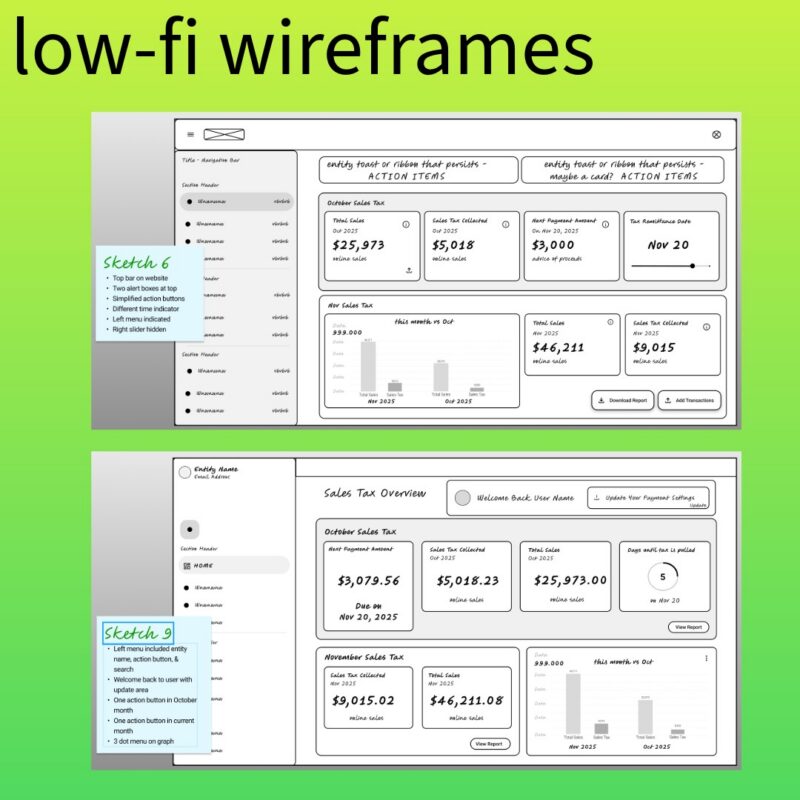
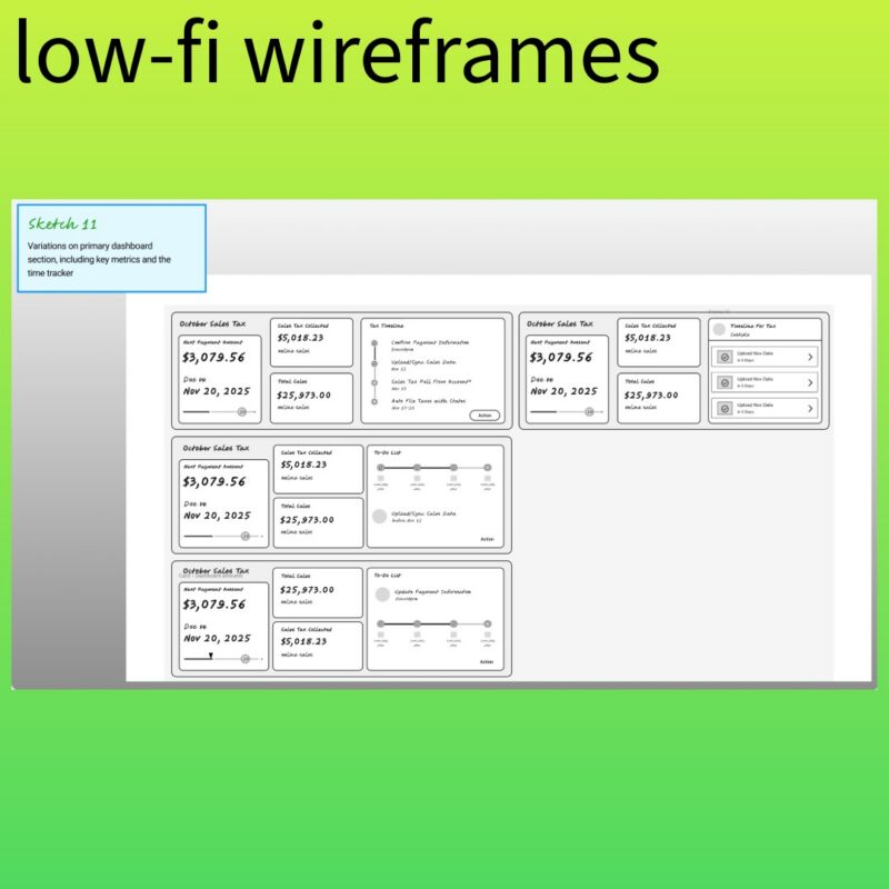
Constant Feedback: We walked through low-fi wireframes together early on, testing layout ideas and locking in priority features before diving into polish.
Dev-Friendly System: Partnered directly with engineering to select a Figma Design System aligned with their component library. By leveraging out-of-the-box UI patterns, we drastically reduced the time spent on custom engineering.
Describing the different users, their needs, and their journey through the product.
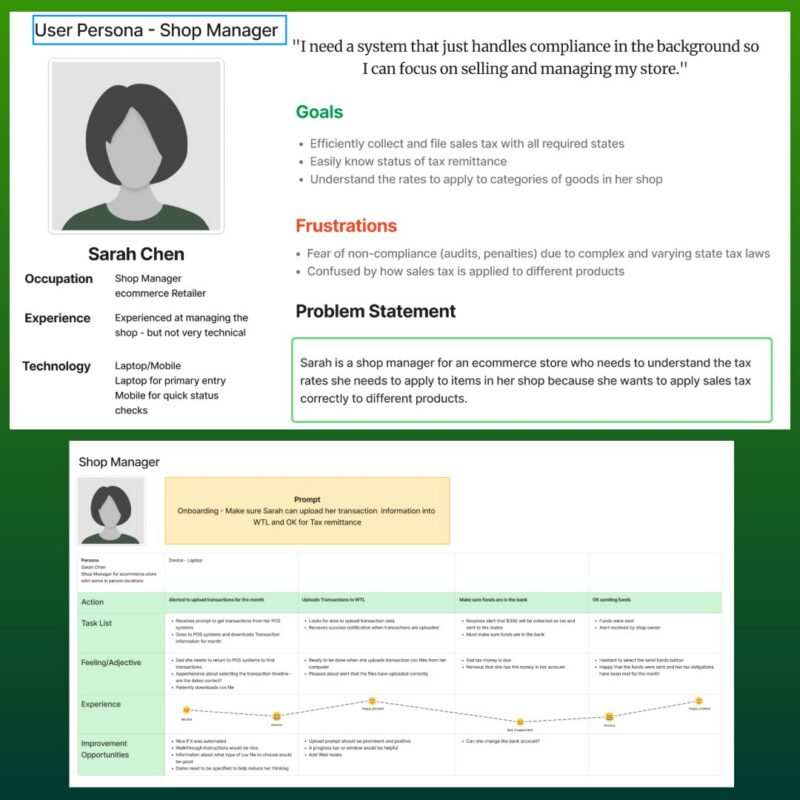

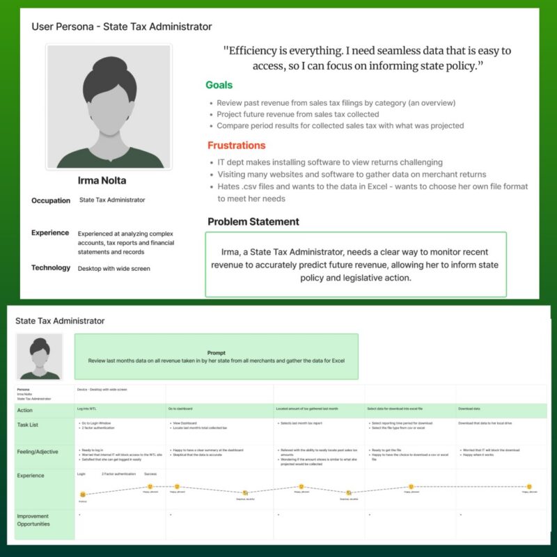
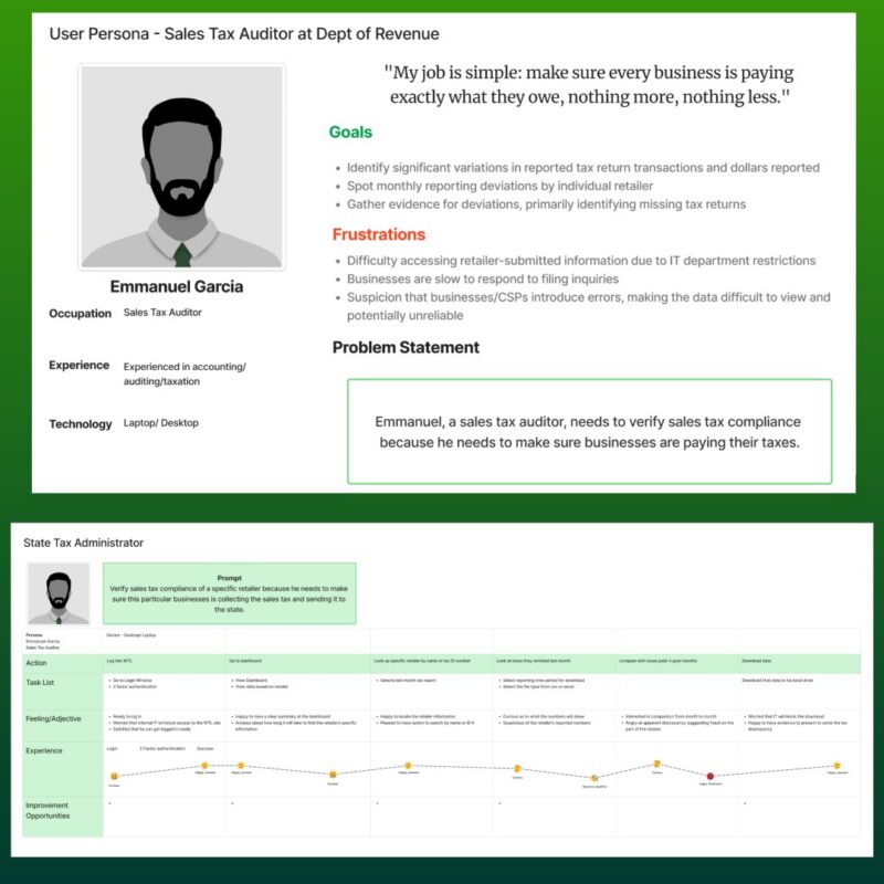
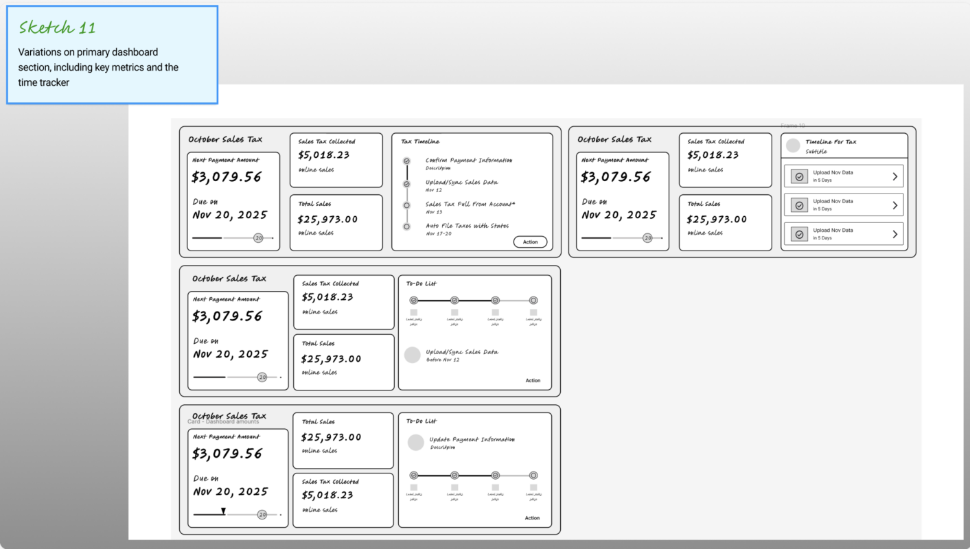
Low-fidelity wireframes enable quick design iteration to identify the design that best meets the user’s needs.
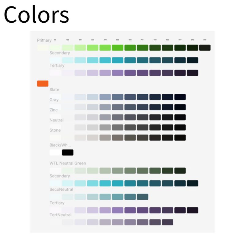
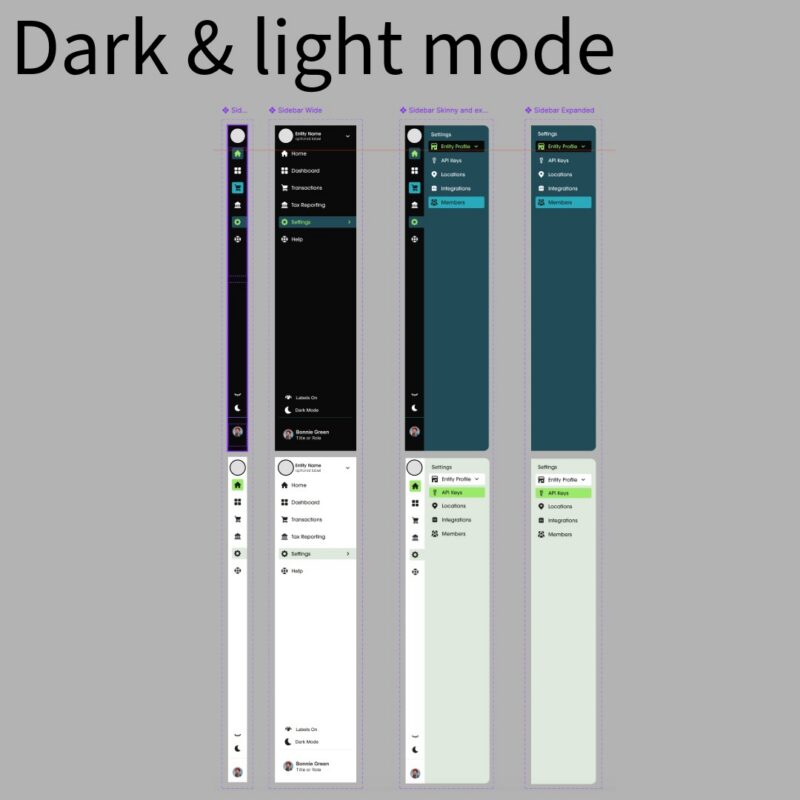
Light & Dark Modes: I ran contrast studies to ensure both modes fully met WCAG (Web Content Accessibility Guidelines) requirements.
Clean Figma Files: I organized the handoff file with clear layout annotations, exact measurements, and token specs so the devs could start building right away without guessing.
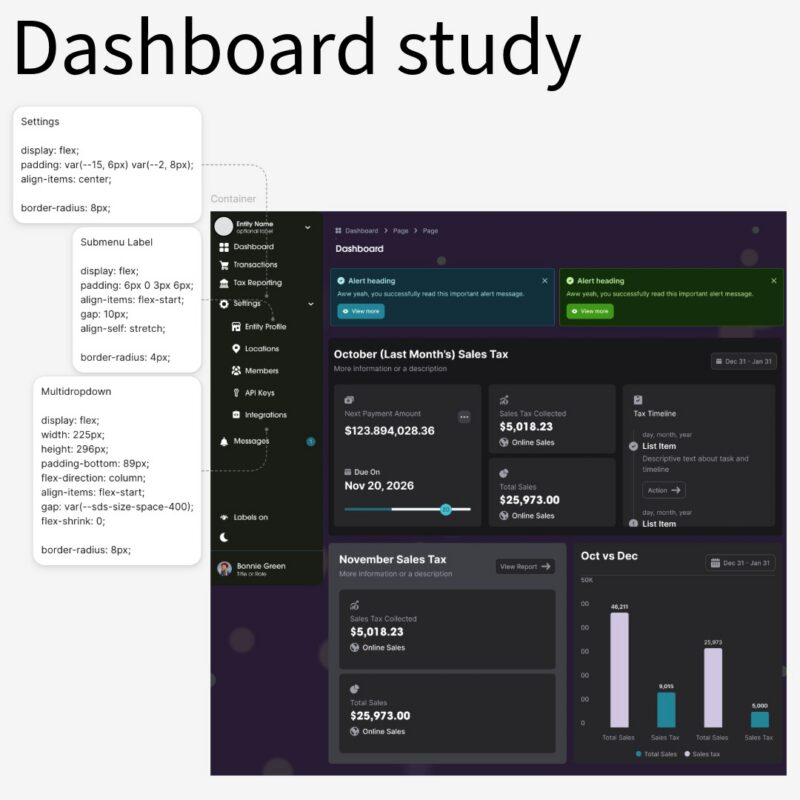
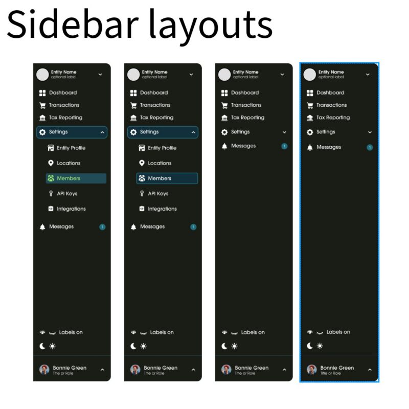
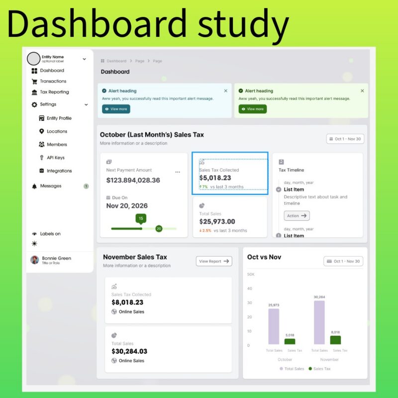
By partnering closely with business and engineering from day one, we nailed down exactly who our users were and built a dashboard that truly solves their problems.
By taking full ownership of the user flows, dashboard explorations, and visual roadmap, I gave the engineering team the space to focus entirely on what they do best: building functional, interconnected features. They could build with complete confidence, knowing the UI and UX direction was solid, tested, and designed to make their final product shine.