How branding and graphic design make a great presentation
What does NACSP have to do with domes?
The newly formed NACSP (National Association of Certified Service Providers) contacted me. They required a logo and material for an upcoming presentation. The members are 6 of the most successful companies who provide online sales tax compliance services for U.S. businesses. They collect sales tax at the time of an online purchase thereby making a daunting task easy. Each state has various rates of sales tax for each county, sales tax holidays, and different rates for different items. How can any business figure this out? That is where the NACSP comes in. The member companies have software that fits in at the point of purchase during the online transaction and figures this stuff out for the business and consumer. This collected sales tax goes to the states. This group meets with the states to find the best way to work together.
Get to know your client and your client’s audience
A quick internet search for NACSP pulled up an entire page of organizations using this acronym. I decided the logo design should contain the name of the organization spelled out clearly. This logo will be spread around the internet with no control over how it is displayed. It must be as clear as possible.
There are 6 founding member companies of this organization. What color choice works for them all? These are the questions I considered:
What does the client do? How can this be expressed in the logo?
Certified Service Providers work with taxes and state revenue departments. That is a lot of time spent deciphering spreadsheets. Common spreadsheet colors are blue, light grey, white. I chose to work with blue.
What is exciting about their work? What values are important to them?
Numbers and spreadsheets are to a tax professional as words on a page are to a novelist. They tell an exciting story of how a business is doing. Success and setbacks are recorded in columns – if you know how to read them. The diagonal element suggests the excitement and movement of numbers these professionals find in their work.
I presented the group members several choices. All of the designs were created in Adobe Illustrator. For some clients I show pencil sketches first. For this group I showed logos near the point of completion. Some people can imagine a final logo from a pencil sketch. Others need to see something closer to a final product. I didn’t worry about details lining up for the sketch phase of the logos. That is something I cleaned up in the final design.
Hawaii State House
Building Blocks – Include the important information
Group name • site url • member companies • a hook for the audience
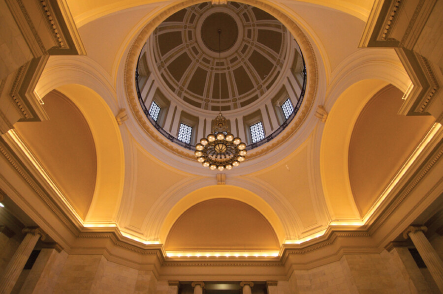
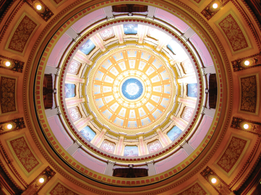
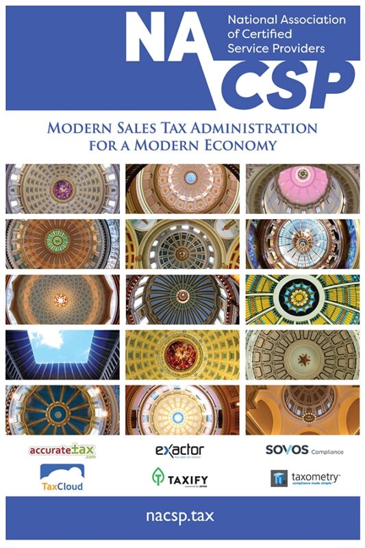
Now that the logo was completed we moved onto the presentation materials. We started with the poster. The audience for the presentations are U.S. state departments of revenue. Each state has its own sales tax rates and rules. Each state is unique. They are as individual as their state capitol rotundas. One member told me how beautiful these domes are and how much they wanted to include images of them in the materials. Domes are the graphic element that will reach out to the audience and bring them in to learn about the NACSP. These state domes became a good talking point during presentations. Anyone knows that being at a business conference can have its less exciting moments. Playing a game of “guess which state dome that is” adds a bit of fun to a presentation.
Linking it all together
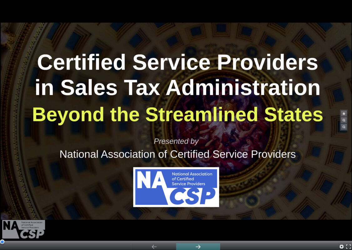
Now we needed to put all of this together in a presentation. We chose to use Prezi. It is an online presentation tool, easy to share, and dynamic. The member companies chose their best presenters to hash out the content. While each company shared an interest of working more effectively with the states, they have different styles. The members chose a unified tone and message. Watching their presentation as it developed allowed me to estimate how many slides I would need. Each slide has a different state dome. With digital finesse, I designed slides that would accommodate text and be easy to read. With all of the text in place I sent it off for the final edit from a presenter. They requested a key for the presenter so they could match a dome to the state. The feedback on the materials I created was great. If you would like to view the presentation you can see the Prezi. In conclusion, a well designed brand and presentation is the best foundation for any organization.
Visit NACSPI greatly enjoyed working on this project. It is a good example of how many elements combined together can make a strong structure. Thank you for learning about my design process and how I collaborate with large and small companies.
I would love to hear what you think about this project. You can comment below.

