Practical Design Advice for Text Size
I was recently reminded of the importance of holding your product design, even when you work on a computer all day.
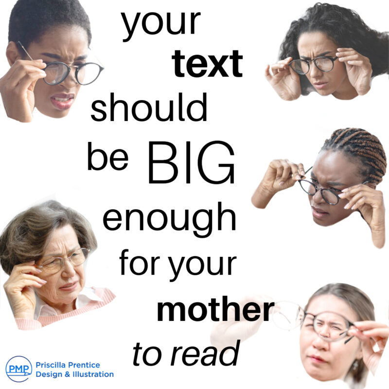
One of the gems of design advice from a professor at art school was that ‘your text should be a size your mother can read.’ It seemed odd and funny at the time. It has come in so handy over the years.
your text should be a size your mother can read
Zoom out of your design!
Have you ever been working on a design and realized that you are so zoomed in focusing on the details that you are losing focus on the larger picture?
Staring at a computer screen messed up my eyes
I was recently working on a design for a product label. It was all looking great on the screen. Remembering that people will interact with the product in the real world, I printed out the label, pulled out the scissors, and taped it to the package. Then I interacted with it like I was using it in real life.
Let’s call this product Hot Sauce. I put it in the fridge, on the door, and the shelf. I lined it up with other hot sauces to see how they all looked together. We have a decent supply of hot sauces because some of my family like things SPICY! The exercise was very helpful. Some of the fonts were too small. Other design elements were a bit fussy and could be paired down. I made the changes and the design was greatly improved.
Your product design will exist in the real world and on a digital marketplace
This exercise gave me a nice break from the screen and reminded me that this would be a real object. That said it also exists in the digital world as one of many options in an online marketplace. With the improvements in the design, I am comfortable sending it off to my client knowing it will stand out in a digital marketplace, on a shelf in a store, and in the end user’s home.